> ## Documentation Index
> Fetch the complete documentation index at: https://velt-mintlify-e6426361.mintlify.site/llms.txt
> Use this file to discover all available pages before exploring further.
# Confirmation Dialog
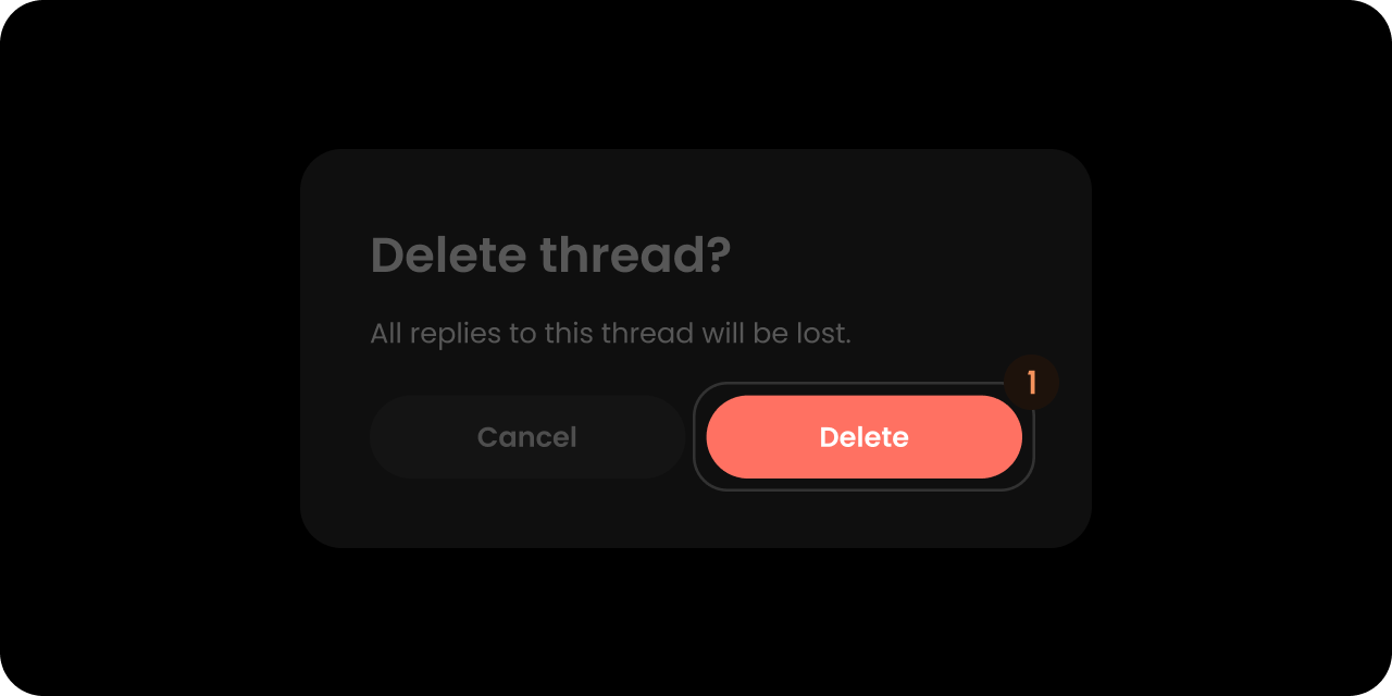
> Customize the Velt Confirmation Dialog that appears when deleting a comment annotation — override the title, message, and action buttons with your own UI.
We recommend that you familiarize yourselves with [UI Customization Concepts](/ui-customization/overview) before attempting to modify any components.
## VeltConfirmDialogWireframe
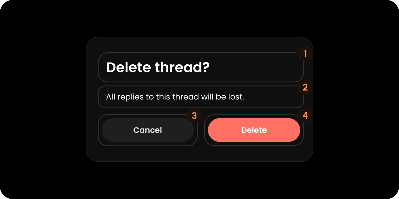 ```jsx theme={null}
```
```html theme={null}
```
## Title
```jsx theme={null}
```
```html theme={null}
```
## Title
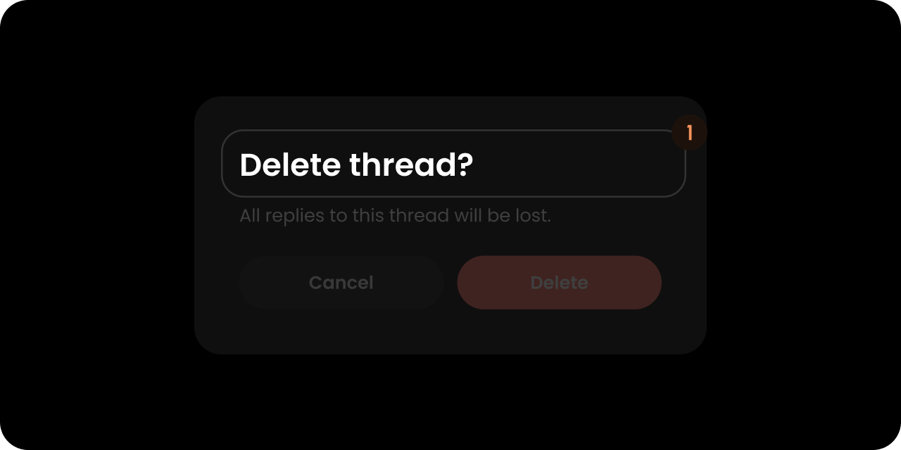 ```jsx theme={null}
```
```html theme={null}
```
## Message
```jsx theme={null}
```
```html theme={null}
```
## Message
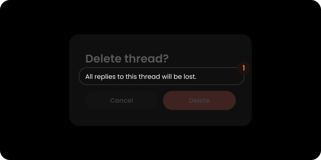 ```jsx theme={null}
```
```html theme={null}
```
## RejectButton
```jsx theme={null}
```
```html theme={null}
```
## RejectButton
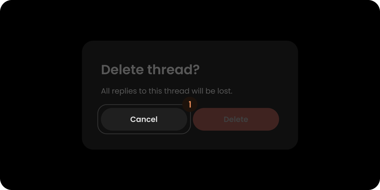 ```jsx theme={null}
```
```html theme={null}
```
## ApproveButton
```jsx theme={null}
```
```html theme={null}
```
## ApproveButton
 ```jsx theme={null}
```
```html theme={null}
```
## Styling
### Disable ShadowDOM
ShadowDOM is not used in this component. You can apply your styling directly to the component.
### Dark Mode
This component takes the dark mode property from the parent feature (eg: comments) where this used.
If the parent feature component is in dark mode, this component will also be in dark mode.
### Type-Scoped CSS Classes
When the confirm dialog is shown, a modifier class is added to the root element based on the `type` prop (see [`ConfirmDialogComponentConfig`](/api-reference/sdk/models/data-models#confirmdialogcomponentconfig)):
* `velt-confirm-dialog` — always present (base class)
* `velt-confirm-dialog--comment` — added automatically when deleting a comment
* `velt-confirm-dialog--reply` — added automatically when deleting a reply
* `velt-confirm-dialog--{type}` — general form for any custom `type` string (e.g., `archive`, `mention`)
* No modifier class is added when `type` is omitted or empty
```css theme={null}
/* Style the delete-comment confirmation differently from delete-reply */
.velt-confirm-dialog--comment { /* ... */ }
.velt-confirm-dialog--reply { /* ... */ }
```
```jsx theme={null}
```
```html theme={null}
```
## Styling
### Disable ShadowDOM
ShadowDOM is not used in this component. You can apply your styling directly to the component.
### Dark Mode
This component takes the dark mode property from the parent feature (eg: comments) where this used.
If the parent feature component is in dark mode, this component will also be in dark mode.
### Type-Scoped CSS Classes
When the confirm dialog is shown, a modifier class is added to the root element based on the `type` prop (see [`ConfirmDialogComponentConfig`](/api-reference/sdk/models/data-models#confirmdialogcomponentconfig)):
* `velt-confirm-dialog` — always present (base class)
* `velt-confirm-dialog--comment` — added automatically when deleting a comment
* `velt-confirm-dialog--reply` — added automatically when deleting a reply
* `velt-confirm-dialog--{type}` — general form for any custom `type` string (e.g., `archive`, `mention`)
* No modifier class is added when `type` is omitted or empty
```css theme={null}
/* Style the delete-comment confirmation differently from delete-reply */
.velt-confirm-dialog--comment { /* ... */ }
.velt-confirm-dialog--reply { /* ... */ }
```